Flat Plans
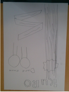
Based on my audience survey results and research into forms and conventions of existing products I have drawn flat plans to use for my cover, content and double page spread:
Organisation
When doing a studio shoot you need to lot of things organised. First the models, my models where chosen a few weeks in advanced I chose them for their more unique personalities and also because I felt that they would suit a magazine of this genre. The next thing that needed to be organised was the costume. I let the models choose there own attire as i felt any issues could be cleaned up on photoshop with relative ease and that I honestly believe that if the models are relaxed and feel secure in their own clothing that the quality of the modelling will be at a higher standard and that as a result a better standard of images.
Next had to come the studio. I set out the camera, the tripod, the sheets and also the lights. I spent about half an hour making sure the lighting was perfect before the shoot. I altered the lights intensity and physical position. I also had to make sure the camera was charged and the SD card was empty. Double cheating your equipment makes for a smooth and fault less session where the only issues come from unforeseeable events.
Equipment:
lighting rig if there is an issue with it we need to utilise natural light. the lighting rig would be preferable as it would have a feel of a we lit area and making it look like a more professional.
costume (jeans and t-shirts) not really any concern as to the procuring this is something they have on them every day. I want them to wear casual clothes so that the models feel more relaxed and look more relaxed when I'm taking photos of them.
camera.
Locations:
The Bodmin College Studio
The Camera:
Out Of need the camera we used was the Cannon EOS 60D, so I decided to look at its specs (specification) online, it has 18 mega pixels which is very good for any camera especially considering the best camera on a commercially available smart phone is 11.5MP and an iPhones is 5MP even though it is bellow average for a professional it is what i need for my magazine. The camera also has a lcd display screen this is good as it means I can look at how many photos I've taken as well as previewing them in a lower quality before plugging the camera in to a computer.
The Editing Equipment:
I used photoshop to edit the photos, as most people would. photoshop is used by most professionals and is so wide spread the term "to Photoshop" is a generic term to edit an image digitally. Photoshop is as good as a piece of image manipulation can be and even though there are cheeper alternatives (Photoshop being hundreds of pounds) for example G.I.M.P. (GNU image manipulation project) a free piece of software that was built from the base code on photoshop CS1 and has been built up by its programers. as good as this piece of kit is it cant hold a candle to CS6.
Studio Set Up
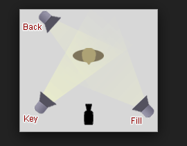
when setting up the studio I set it out like this example I found when researching lighting online at
I also looked at how to conduct a successful photo shoot on other internet sites. One that helped me a lot was this one http://www.wikihow.com/Have-a-Photo-Shoot-at-Home from my research I was able to comprise a personal list to have a great photo shoot and I think it paid off because I took some of the best pictures I have taken.
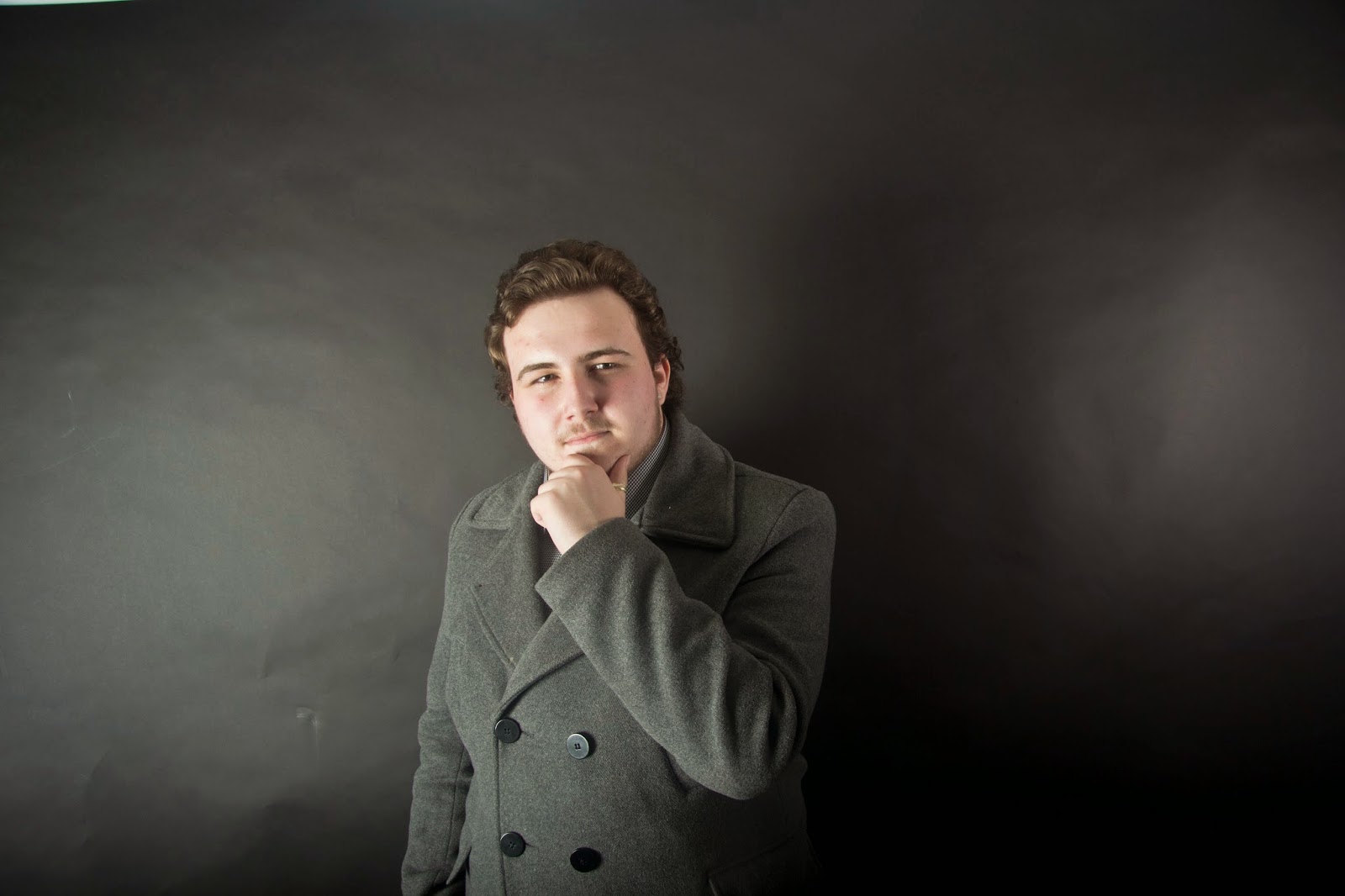
I used a black backdrop to help get the mood I wanted from the lighting. Here are some examples of the images I got through doing my shoot in the media photography studio using the 3 point lighting method:
The Photos
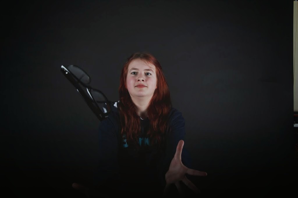 When choosing images you need to look out for certain things that define a good or a bad image. the image on the right is a good image for a few reasons. It's interesting as it has action happening and due to the high shutter speed there is basically no motion blur. On top of this the model is in clear focuses is the pair of glasses flying in shot. This image would be good for a front cover as it has a medium shot of the model and it is interesting picture that may draw in people and be interesting to see.
with this sort of shot the lighting is a large part this is why in my preparation I decided to put most of my time in to the lights changing a verity of things from the flash to the basic back lighting. If you get the lighting to low you have a black image and too hight any your model looks as pail as a ghost. the balance is surprising that you need to get it too.
One large issue you see in Photos is the ISO is turned too high why this is an issue is explained later.
Using a camera
 When you are taking a photo with a high(ish) end camera there are a few terms you need to know about before taking a good quality image and this is before setting the stage and models.
First there is the aperture, other than being a fictional science corporation this is a huge part of taking an image. The aperture is how much light is let in to the lens via a hole in the end of the camera that increases at the number decreases this is the main way you increase the Brightness.
However if you don't have enough light there is something else called the ISO. This just artificially increases the light and can be useful but the issue is with a large ISO the images quality decreases and becomes grainy, this means that lighting is one of the most important things when taking a studio shoot.
Style Models: Looking at an Existing Photographer Who Is Successful in the Music Photography Genre:
 I tried to copy the style of photos of the Kerrang photographer Paul Harries, who takes photos for the cover of Kerrang! I particularly liked the cover to the left as his style of photography is very staged and not at all naturalistic and takes taking photos to seriously which is great for a well established music magazine but not for a niche magazine. I think my images follow the conventions I looked at here but break them as well because I have gone for darker effects to fit the jrock genre. What I liked about Harris' pictures and what I tried to imitate in my shoot were his quirky poses.
Editing:
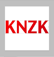 Here is the Alpha stage of me coming up with ideas for a Masthead.
First I put up the text KNZK and made it in to an image layer so i could select the image and change it in to a gradient colour.
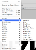
 I next duplicated the font and made it in to just a plain black colour. so I can create a more effective shadow effect than the drop shadow effect in the options. Then choosing the motion blur I made the blur be at the same angle as the gradient on the other text layer and put it under the layer with colour this creates a cool shadow effect that makes it look more 3D. Finally I added a background with the same gradient at the text and finally it looks like it is a 3D red text on grey background. Finally I added a background with the same gradient at the text and finally it looks like it is a 3D red text on grey background.
 Then choosing the motion blur I made the blur be at the same angle as the gradient on the other text layer and put it under the layer with colour this creates a cool shaI added a background with the same gradient at the text and finally it looks like it is a 3D red text on grey background. Finally I added a background with the same gradient at the text and finally it looks like it is a 3D red text on grey background.
In looking at the finished piece I decided that there is one large issue with it, and that is that it doesn't represent my audience. it has no aspect of it that you can look at and say "that belongs to a rock magazine" or "that looks Japanese." and this creates an issue when people I'm trying to build a brand. so the next mast head I will build will have aspects of rock by making it look rebellious. I ended not using this as the mast head.
here is a simple photo I took that I edited to look better as an image by only making small changes that will amok massive differences in the image and even to its connotations.
Here is the original image unedited because of the file type it won't open in a lot of programs hover it will open in programs such as photoshop and G.I.M.P.
When you open this type of file in photoshop you will be greeted with this file this is because of the type of file being "awkward" to encode in to an actual image. However this does mean editing becomes that much more simple.
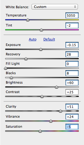 this panel has everything you need for basic tweaking in the images. the goal is to make the image looks as close to life as you can get it however sometimes you may want it more bright or stylised which is where personal chose comes in to it.
 you can see that in this there are 3 separate sections that have been parted with a line. The top one is wall about over all colour tinting as both tine and temperature tints the image. the next section is all about the lighting and the shadows of the image this is what I had to spend the most time on as it is a complex image as far as lighting is concerned. The final part is about the colours already in the image and there intensity this part is vital if you wish to make a stylised looking image. on the right above is the final piece after editing the image.
My Draft Article
In my research I looked at how to do interview articles. I made an interview up with my fake star band for my interview...
Today in our Kinzoku exclusive we talk to the budding star
“Sakura Katakana” the latest in a new generation of J-rockers who we have
coming from the label bringing westerners into the J-rock scene. We got an
interview with her at our photography head quarters in Hiroshima.
On first glance you can tell she is the sort of bubble, mad
and crazy sort of personality that does not fair well through the Japanese
mainstream pop culture but this sort of attitude seems to thrive in the J-rock
scene of today.
We started by asking her about how she started in music. She
answered; “When I was young I was listening to classical music, my parents were
massive traditionalists, and one day I thought to myself that all music is good
but it needs to be fun. I said it needs madness and it needs to be about the
more positive emotions of life and look at the positive of extremes like love.”
Following on from this profound answer, we had to ask how
her traditional parents
reacted to her music and her style, she told us; “They hate
it and that’s why I love it. Honestly my music is for myself, and people who
share my sentiment. My music may be heavy rock but it does not mean it can’t be
fun as all hell.”
We then went on to ask about how she feels about her first
ever album coming out soon, she set us straight by saying; “It’s not my first
album. I have about 3 online for free you can get hold of. But if you mean my
first big album with actual money behind it…(laughs) Dope as fuck.”
We went onto question her on her choice to announce her
album on the first of April and what people’s reaction was to the announcement,
Sakura told us; “I thought it would be funny, on the one hand some people would
think it a joke and on the other hand there will be those who will believe. I
love the idea of someone getting on their high horse about it being a prank
only to realize it was all true in the end.”
One question you always here when a new person comes on the J-rock scene is Do they like J-pop. So we decided to ask her this, she responded;
“I actually like J-pop. It seems to be the only pop culture that does not take itself serious in any way, Like did you see the video kyary pamu pam came out with just the other week, insane and I love it. I think that there is something about japan that brings the maddest in everything, You guys did the Japan only Avril song hello kitty right?”
To find out more about her up coming album go to our site
at:




Joe's planning and research evidence is partially incomplete;
ReplyDelete␣ There is basic research into similar products and a potential target audience;
␣ There is basic organisation of actors, locations, costumes or props;
␣ There is basic work on shotlists, layouts, drafting, scripting or storyboarding;
␣ There is a basic level of care in the presentation of the research and planning;
␣ Time management may not be good.