Magazines exist to make money, and that is the main objective. To make a magazine that will succeed that objective I must look at magazines that already succeed in this very area by being a big magazine that makes money in order to see what makes them popular. In other words, I need to learn what conventions and technical/creative skills and media language to use on my own products...
Cover Common Convention Analysis
This is Zippo a Japanese magazine that is both a fashion magazine and a music magazine.
the main colour scheme is red, pink, yellow and black however the majority of the black is on the model and in smaller text. this pallet in most circumstances may be a bit too bright and would look unusual in most english newsagents, however in japan this is the norm. This is due to Cultural differences and in there konbini (コンビニ) there is a huge verity of magazines and the front cover is even more important and needs to be as bright and visible as possible to be seen over all competition to be picked up by its demographic.
This pallet is very feminine due to its yellows and reds and as a result it is very safe to say this magazine is aimed at the female demographic as it is a feminine colour and used as a common conversion when appealing to females. If I were to change this I would make the colour scheme more centred around the pink rather than the red and yellow. I feel this would make the cover stick out more.
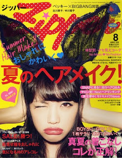
When magazines are being displayed in most konbini in japan it isn't the left third that is on display but the top fifth or so. this is why at the top is one of the biggest stories about one of the biggest bands from South Korea Big Band. they also have the mast head this makes sure there already existing readers know where the magazine is as well as building a brand for those who don't buy the magazine all ready.
The mast head suggests it is aimed at a younger audience firstly because it has a Katakana version in the very top left for anyone unable to read the English but not only this but it is in an almost lace font in that is is patterned and flowing. The man clue regarding the mast head is the name of the magazine is very feminine and cute as it is soft due to is lack of any harsh S, K or D sounds, and in japan this is important when it comes to advertising to a specific gender.
The main image is of a woman with black lace bunny ears on her head, this links in to the whole fashion magazine aspect of it. the way the model is with her hands over her ears and lips pouting is a take on Kawaii (かわいい) which in literal terms translates to cute but is different. kawaii is using childish mannerisms and using child like phrases and this is quite popular among teens from 15 to 18 across japan. the way she is acting is contrasted by the black ears as black isn't associated to kawaii and is almost the opposite. this shows it is aimed at teens. I feel that having black on this magazine against the yellow of the back ground and the red and pink of the foreground, it is effective because if something contrasts you are more likely to see it as a consumer of magazines.
the language used is a combination of kana and hiragana which is known even by children, Kanji which is a harder form of hiragana and is taught at high school age and finally some english which is a base lesson taught in lessons at schools across the country. The mash of english and kanji heavily suggests it is aimed at teen and up again reasserting it is aimed at teenagers.
The fonts used are varied but the mains two fonts are quite thick and flowing especially the main tex that is written in katakana which is predominantly very sharp and harsh but the font makes it a lot more flowing and this is designed to appeal to girls. This is done to appeal to there main audience and make there audience pick up the magazine.

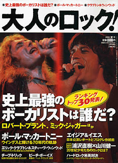
This is an older Japanese Rock Magazine. It is called 大人のロツクor to roughly translate is if alone the lines of Adults Rock or Rock of adults. This is typical of a Japanese magazine as they tend to have more simple names.
Straight away without have to look at the design you can see that this is aimed at an older generation of rockers. This is because it is called Adults rock, meaning it is rock for adults. However there are other ways it is obviouse that this is for an adult audience.
Firstly you can see that the colour scheme is black, white, brown/red and yellow. In Japan that shade of brown/red is a very traditional colour and is basically never used in something you want to aim at a younger generation, however yellow is is seen as more of youth colour so this cover does go against the Japanese media convention as far as I can see in my research.
One more way that you can see that it is aimed at an older generation is the language used. It uses a lot of Kanji a complex form of Japanese writing that you don't learn in school until you are older. while learning Japanese I read that "Most people don't learn all the Kanji they will see until they are much latter on in life." This shows clearly that it is aimed at an older and potently more educated audience.
Aslo one noticeable point is that even though ツク(Roku) is English it is still in Katakana and not been put in to Romaji. This has the connotation that it is aimed at an older generation as they have a much lower english literacy rate as modern Japanese schools teach english until they are about 18, compared to the old school teaching where not so much effort put on to people learning english.
The main image keeps to the colour scheme clearly. It is of two older musicians from the previous generation of rock. Another thing that shows it is for an older generation. The two singers have the connotation of the old style of musicians. The way they are posed is very reminiscent of the old rock.
Just like the other Magazine this one puts more effort on the top 1/3 as that is all that is visible in a lot of conbini. It has the vital info in the red and the magazines title on the top, as well as this you can see the artists faces in the top. one noticeable thing is that almost all the text is in the bottom half of the page.

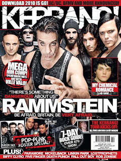
This is the front cover for the rock/metal magazine Kerrang! It uses the colour scheme of red black and white. it very much connotes the rock genre and the rock culture. The colour red is long established with the rock genre. It is connected with blood, anger fire and war, these sort of things that this sub culture wishes to comet themselves to.
The language it uses lends itself to the audience that it wants to attract itself to. It uses and highlights phrases like "Dangerous" and "Very afraid". this sort of language lends itself to the Rock and Metal culture as well as to the youth culture.
The band on the front of the magazine are a metal band and the way they are positioned they are appealing to youth. They look dark and very rock in that they are only wearing black and wearing clothing that is stereotypical of people in rock.
Other images that are on the cover follow a smiler convention of wearing black clothing and having a pose associated with the rock culture.
The left third of the magazine is the part that is most likely to been seen on magazine racks and in this part they have put a few things: The first being the two most recognisable men in the band Rammstein who stand out as being the most "Unique" looking members and a fan would recognise them in a moment. This is also in the left and near the top right below the mast head, the audience is more likely to be drawn to this part of the magazine first after the mast head.
The second thing is the "Mega HIM Comp!" sign. this will draw people in as this is a clear dew to bring more people to buy the Magazine itself.
And the final thing that is clear dew to the magazine that is in this spot is on the bottom where it clearly says "Plus" this is a draw to get a casual viewer to read what is actually inside the magazine above what they have seen.
Content Page Common Convention Analysis

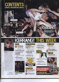
This is the contents page for the magazine kerrang! It's colour scheme is white, black, and yellow. The colour yellow does not usually have connotations in rock in the west and is seen as a very happy colour however kerrang have built a brand from using this colour and as a result it has begun to have this connotation of rock music.
The main image is of a rock consort and of a man crowd surfing while singing in to a microphone. This plays up to the stereo type of youth as fun and as a result represents youth culture as well as just the culture of rock itself.
The text that is used is simple to read however not to the point of something that is aimed at a child or someone not educated. this suggests that this magazine is aiming itself to a more upperclass market and away from the lower working class and away from young children.
In the left hand side at the top you can see the pages from inside of the magazine. this is to show the reader what to expect inside the magazine. this is done more for the people who have not yet purchased the magazine as this page is almost as a second front page and needs toehold the attention of the reader fi they want to sell.
This contents is from a Japanese pop/rock magazine Junon.
Its primary colour scheme is pink, white, black and purple. this is a very feminine colour and conveys heavily that it is aimed at a younger female audience. yellow and pink are very feminine. the bright colours contrast each other well as they don't appear to over power the other colours and actually compliment each-other, this has the effect of an easier to read page. this has the connotation that it is not aimed at an older audience and more for the -30 group.
The colours do however make the magazine seem quite chaotic as each line of text seems to have a different colour to the last. event though it is easy to read against the background you feel unsure on where your supposed to look.
The magazine has a plain white background which without would make the magazine look more chaotic but with is it makes it seem more like ordered chaos.
The font used is very bold and for a japanese font it is very curvy this reinforces the idea that it is aimed at a younger audience. the font is also very inconsistent as I can see at least 3 to 4 type faces just in this this adds to the previously stated chaos of the general magazine and at time makes it hard to read, for example they use more complex symbols but use a thick font with a small size, this is bad design.
The language used in this magazine is a mixture of informal and formal this is typical of magazines aimed towards teenagers as apposed to a magazine aimed at an older audience which would use very formal language, this means it a very safe assumption its aimed at a younger group of people.
another thing about the language is the way its written it uses a fair amount of common kanji and very little hiragana and katakana in comparison, this suggests overtly that it is aimed at the older spectrum of teens so probably 15 to 2, this is because a younger reader may find it hard to navigate the symbols and a magazine aimed at them would only use hiragana and katakana with very little use of any kanji.
The language also uses broken English also suggesting teens as in most schools in japan english is a core lesson and mostly compulsory, so younger Japanese people will be a lot more likely to know what it says compered to an older person who didn't have the same education.
all but one image is of one idol looking out at the reader, this is to show an almost closeness between reader and idol. this exploits the large celeb culture that is abundant around the world. this is used to sell more magazines this will be the first page they see after the main cover this page affirms there want for the magazines.
The images are there to promote the people being interviewed as this magazines USP is that it is mostly interviews with there idols, this also reasserts the fact that this is a magazine aimed at younger adults and older teens.
Double Page Spread Common Convention Analysis
This is an article that interviews the old school rock band "Metallica" one of the most influential bands in the circle of heavy rock and metal.
The first thing to point out is the fact that the article itself goes against the stereo type for a rock band. The typical view of a rock band is Sex, Drugs and rock and roll where as this article is all about the band as these older men who live like "Normal" people. they have children and most in relationships. This sort of magazine article would not appeal to a younger reader for a few reasons: Firstly the fact that it is about a band that is from a previous generation of rock (However many people who like heavy rock also have an appreciation for the "Classics"). Secondly because the article is about getting away from the vices that normally cover the pages of magazines aimed at a rebellious youth. the article is more about settling down a topic that is more or less unrelatable for younger people.
The colour scheme for this seems to be black, white, violet and a sort of pastel skin colour. The violet connotes relaxation because it is such a calm colour, it is clear that this was a choice for this article because of it's calm nature. the skin colour is not just on the main image but also used in almost all the small images and even in the text to highlight it. This is also another calm and relaxed colour and is odd in a rock magazine as rock is plagued with make up such as rice powder to make the artists pail.
The language used in this magazine article is more elaborate than what you normally find in a rock magazine. This is a further piece of evidence that this is not aimed to a younger group of people and more at people who remembered this band and are older.
The main image is of the band without makeup. The pose that they are in is reminiscent of the old band when they were at their most popular. this is meant to herald back to the old days again appealing to the older generation of rockers.
This is double page spread from the magazine Q about the female musician lady gaga.
The colour scheme is black, white and red. This is evident in the fact that the main image is in back and white as is the text with a large red L in the background. On colour alone it is impossible to tell who the magazine is aimed at as red is a gender and race neutral colour.
The image of lady gaga is her being mostly nude and shows clearly the article is aimed at a more mature audience, however her breasts are clearly not the center of attention as they are behind chains, hands and half the page. this suggests it isn't designed for men and is more aimed to look more like an empowered woman and as a result aimed at the female audience.
the language used is more complex and uses longer words with more complicated grammar than one would expect from a magazine aimed at people with less of an education excluding both younger audiences and audiences of a lower social economic standing. this is because as a rule people who earn less had less education.
Another thing that adds to this idea is the artistic and high brow style of the article with the only colour being the large L in the back ground of the text this again links to the stereo type of people of a low social economic status are less educated and would not get the artistic expression of the style. another aspect is actually just the colour of the L the colour red can connotate importance and regal as it is a colour associated with the British royal family and everything they do.
The language used is more complex when compared to most magazines and is clearly aimed at an older audience who would understand the language. you can tell this by its use of long words and more complicated sentence structure. when you look at magazines that are aimed at a lower age and social demographic you tend to see simple sentence structures and they tend to use less formal and simpler to understand words.
This magazines style of writing is contrasting to the style of kerrang as kerrang uses a more informal language this is because of the contrasting audiences they are trying to bring to there magazine.


 This is my basic plan for my magazine front cover and is only a basic look at how I might lay out the magazine. I feel that this is a very important step as it gives you a very good idea of how things are going to be lay out, when you have the assets on the cover it is hard to see where things lie spatially.
 The image I chose connotes the feeling of fun and still embeds itself in to the rock culture due to the fact that he is just rocking out to air guitar. I used the mask tool to change the colour of his clothing again to go with the page and its over all colour scheme.
 I made this page using the same method as the others by placing simple shapes on screen and then rotating them and changing there shape to look more visually pleasing. The white spaced i used for text and buy adding a drop shadow in the way I did you get a better looking cover because when a cover seems more 2D it looks more dull and people tent to like the look of a more 3D and layered page. In this page it still has the same colour scheme however the red is more subtly placed as it is only in the main images instead of in any objects or shapes. This choice came from my want to not distant the audience from the article and yet still draw them to the pictures.
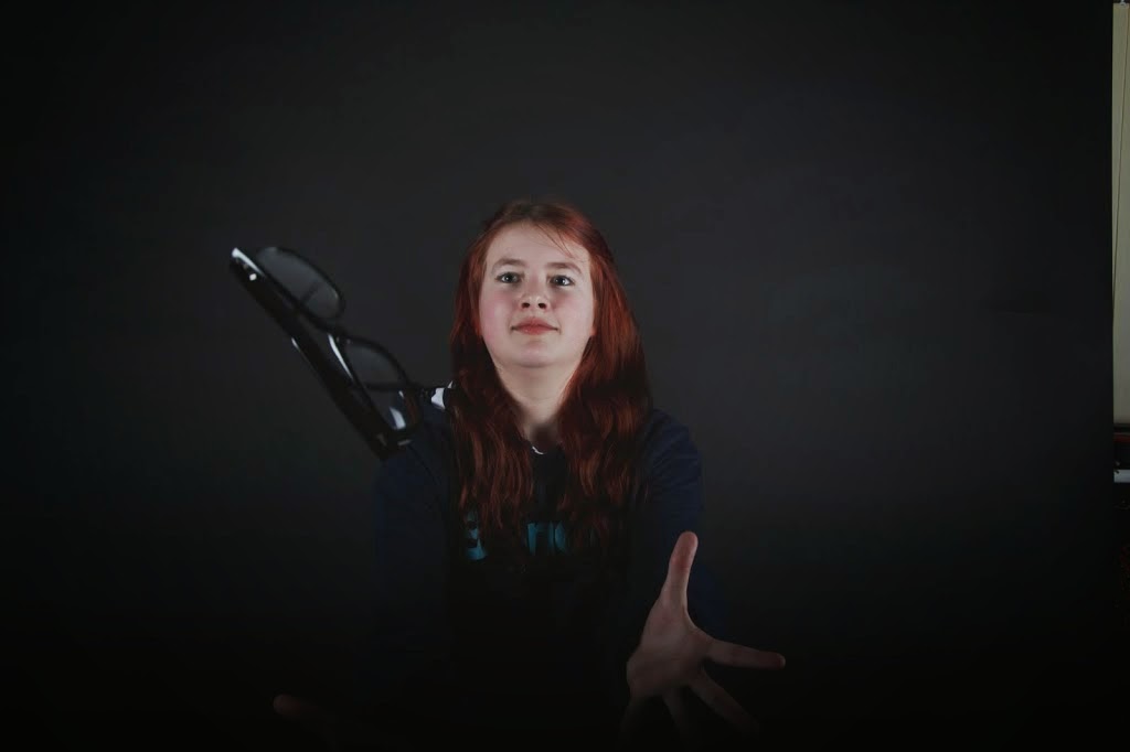 When choosing images you need to look out for certain things that define a good or a bad image. the image on the right is a good image for a few reasons. It's interesting as it has action happening and due to the high shutter speed there is basically no motion blur. On top of this the model is in clear focuses is the pair of glasses flying in shot. This image would be good for a front cover as it has a medium shot of the model and it is interesting picture that may draw in people and be interesting to see.
 When you are taking a photo with a high(ish) end camera there are a few terms you need to know about before taking a good quality image and this is before setting the stage and models.
 I tried to copy the style of photos of the Kerrang photographer Paul Harries, who takes photos for the cover of Kerrang! I particularly liked the cover to the left as his style of photography is very staged and not at all naturalistic and takes taking photos to seriously which is great for a well established music magazine but not for a niche magazine. I think my images follow the conventions I looked at here but break them as well because I have gone for darker effects to fit the jrock genre. What I liked about Harris' pictures and what I tried to imitate in my shoot were his quirky poses.
 Here is the Alpha stage of me coming up with ideas for a Masthead.
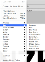
 I next duplicated the font and made it in to just a plain black colour. so I can create a more effective shadow effect than the drop shadow effect in the options. Then choosing the motion blur I made the blur be at the same angle as the gradient on the other text layer and put it under the layer with colour this creates a cool shadow effect that makes it look more 3D. Finally I added a background with the same gradient at the text and finally it looks like it is a 3D red text on grey background. Finally I added a background with the same gradient at the text and finally it looks like it is a 3D red text on grey background.
 Then choosing the motion blur I made the blur be at the same angle as the gradient on the other text layer and put it under the layer with colour this creates a cool shaI added a background with the same gradient at the text and finally it looks like it is a 3D red text on grey background. Finally I added a background with the same gradient at the text and finally it looks like it is a 3D red text on grey background.
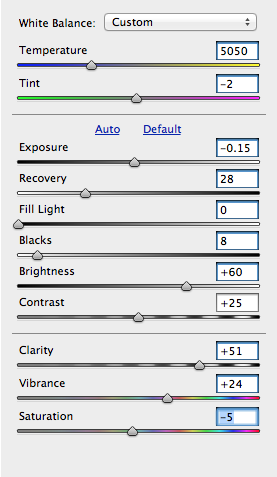 this panel has everything you need for basic tweaking in the images. the goal is to make the image looks as close to life as you can get it however sometimes you may want it more bright or stylised which is where personal chose comes in to it.
 you can see that in this there are 3 separate sections that have been parted with a line. The top one is wall about over all colour tinting as both tine and temperature tints the image. the next section is all about the lighting and the shadows of the image this is what I had to spend the most time on as it is a complex image as far as lighting is concerned. The final part is about the colours already in the image and there intensity this part is vital if you wish to make a stylised looking image. on the right above is the final piece after editing the image.
 comparing both the videos you can see there is a similarity in that both use animated counterparts of the band members. Japanese metal actually borrows a lot from the Japanese rich culture of ghosts and myths and a lot you will find that in Japanese metal they will sing exclusively about a myth or urban legend.
 When magazines are being displayed in most konbini in japan it isn't the left third that is on display but the top fifth or so. this is why at the top is one of the biggest stories about one of the biggest bands from South Korea Big Band. they also have the mast head this makes sure there already existing readers know where the magazine is as well as building a brand for those who don't buy the magazine all ready.