
 Firstly, while looking at old NES covers for dimensions, I used my Wacom Drawing Tablet on a basic Photoshop file (Depicted Bellow the Cover photo). After cleaning it up a little I used the pen tool to create the shape for the top section and used the right click function on it to create a work area and chose the fill shape option. I did this because it is not only easier saving me a large amount of time but also it is more accurate and easier to correct if you make a mistake.
Next with feathering and bi-linear resizing disabled to create a slightly more sifter look to the main character, this is a style choice by my decision however is something that the NES covers did not originally do. The reason I had to change so many settings is due to the size of the original image coming in at only 32 pixels tall due to the fact that this is an image from the game made using Pickle.
To create the speed effect to the main character all I did was create a duped layer from the layer with the character and I placed it below the original and used the motion blur tool to create this dashing effect.
Then I added all of the main text on the cover, I chose which font would look the best and in then end decided on a font that when altered looks the most like the classic NES font. The altering of the font was just to use the skew tool in conjunction with the rotation and the perspective tool on Photoshop.
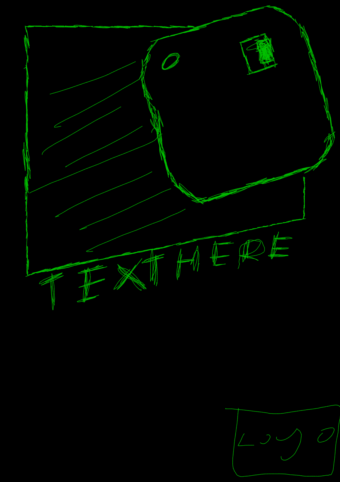
Next what I did was that I created the hand drawn logo for my game company in Photoshop using my drawing tablet and two brushes, one a pencil styled one and the other just a good brush for filling colour with some blending.
The ratting on the bottom-left of the image is from the website that the game was originally published as getting an indie game to get an ESRB or equivalent rating can be a little bit difficult and frankly often is pointless unless you intend on physical distribution over or in conjunction with digital distribution.
• There is minimal work on shotlists, layouts, drafting, scripting or storyboarding.
ReplyDelete• There is minimal organisation of actors, locations, costumes or props.
• Time management may be very poor.
• There is minimal skill in the use of digital technology or ICT in the presentation.
• There are minimal communication skills.
• There is minimal care in the presentation of the research and planning.